WFH Co-Work & Café Brand Identity
Graphic Design
Student Project
Branding
2024
WFH co-work & café needed a brand identity to connect with their target audience. I began my design process with demographic, psychographic, and competitor research and mind mapping. I then chose a few keywords from my mind map and WFH's mission statement: dynamic workspace, comfortable, welcoming, and flexible.
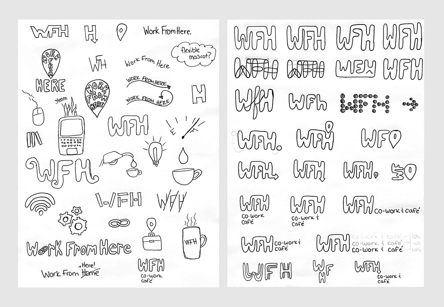
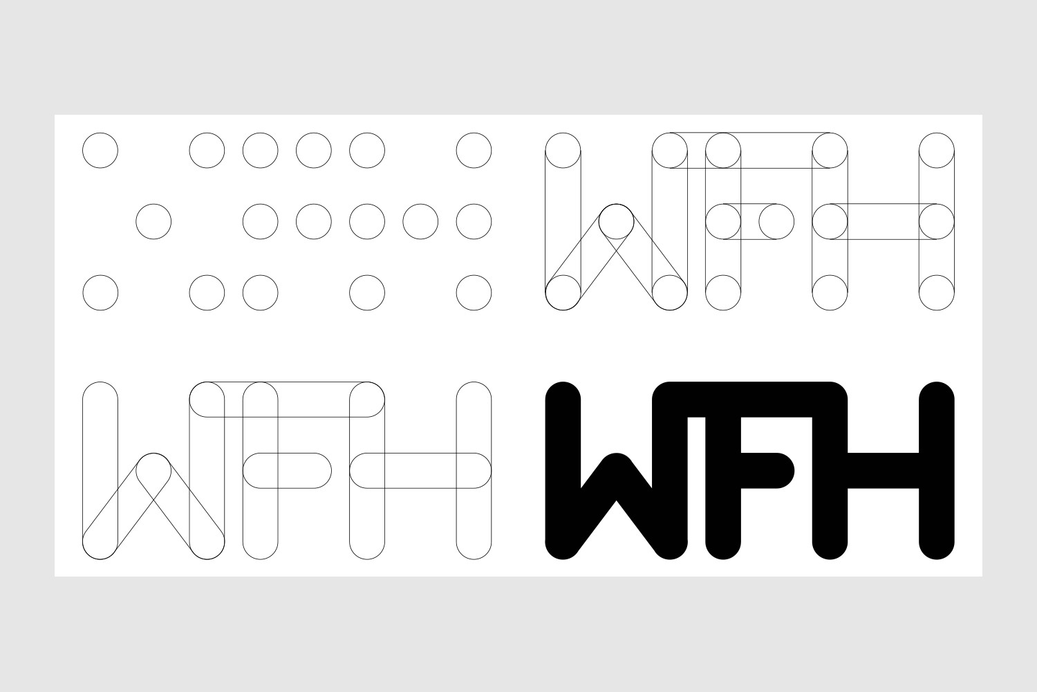
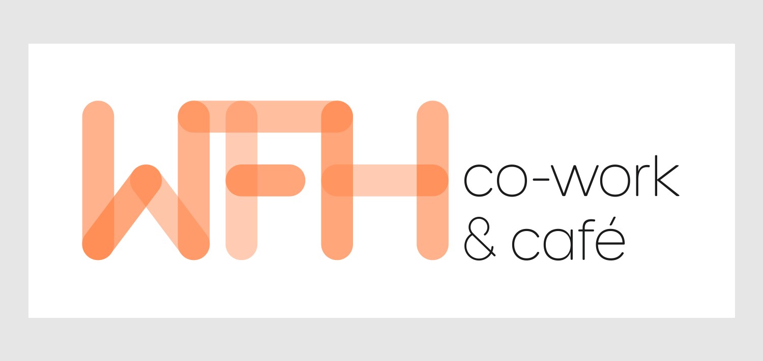
From my research, I began sketching logo ideas and thinking about colours. With feedback from my peers, I narrowed my sketches down to one central idea and explored different compositions of that idea. The general theme of the final idea was to create a wordmark by joining geometrically perfect circles together.
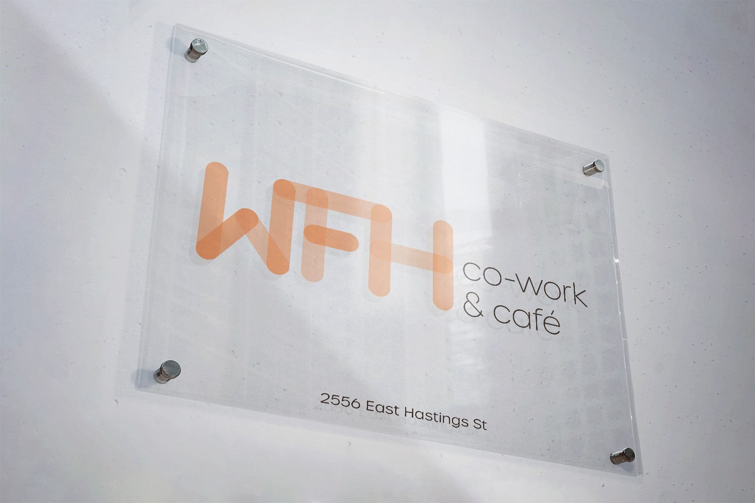
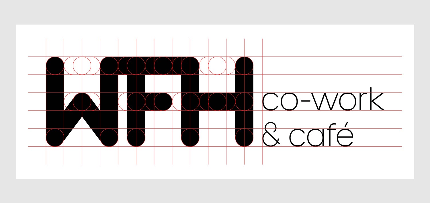
The final logo is a combination symbol comprised of a wordmark and a signature. I chose a rounded, geometric typeface for the signature and the brand font to complement the shapes of the wordmark.
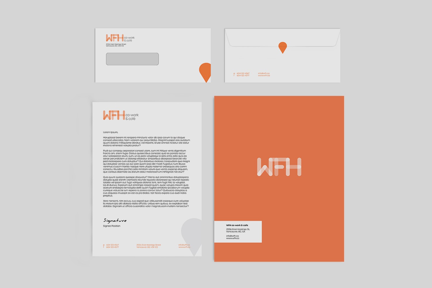
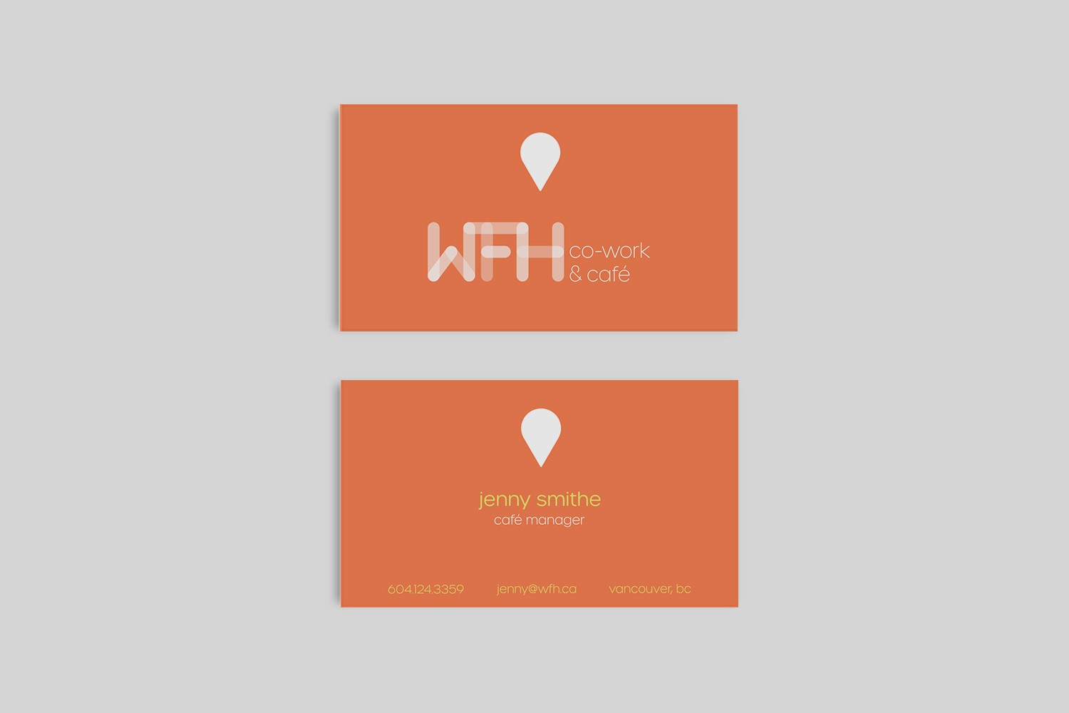
The main colour palette consists of a beautiful tangerine orange and a charcoal black. These colours were chosen to portray a warm, welcoming feeling and an air of professionalism and sophistication. The secondary colour palette consists of a triad colour scheme based on the main tangerine orange. A bright lime green and lilac purple complement and contrast the main palette well, introducing some fun into the overall brand identity.
